After a few days of using the new iPad 3, it seems likely that, in the future, documents will be designed to take advantage of its retina display. Below are some thoughts on the new trends we’ll see in the way documents are designed for reading on tablet devices.
The paper metaphor
It has been good practice to present information published on paper and information published on screen differently. The limitations of computer screens, (for example, the screen resolution, screen flicker and eye strain issues) have meant long, linear documents don’t work on a screen. People like the resolution, portability and ability to make notes that paper provides. Paper simply is a great medium for deep learning and reading on the move.
It means organisations expect PDFs to be read on screen, when in reality they are printed out by users. Often the promised printing savings by distributing content online were never actually realised.
With the iPad 3’s screen, most of the limitations of reading on screen have been eliminated. Indeed, Apple is promoting it as a device for reading textbooks – which is can be an example of deep learning. It’s like paper in that it’s portable, you can make notes and you don’t get eye strain.
This means, we’re likely see documents on screen that look like documents printed on paper. It may be time for Technical Authors to dust off that copy of “Dynamics in Document Design”! For books that use Apple’s iBooks, we’ve found you tend to read page by page, instead of using the “peck and scan” approach common reading online content.
A new metaphor for online documents – Metro
The paper metaphor is not the only metaphor you can use. The new Metro UI, developed by Microsoft for Windows 8 and smartphones, is another design metaphor that is being adopted.
The Metro UI uses the following approaches:
- Information is consolidated groups of common tasks to speed up use. This is done by relying on the actual content to function as the main UI.
- The result is an interface that uses a “grid approach”, using large blocks (instead of small buttons, as well as laterally scrolling “canvases”.
- Page titles are usually large and scroll off the page laterally.
- The UI responds to users actions, by using animated transitions or other forms of motion.
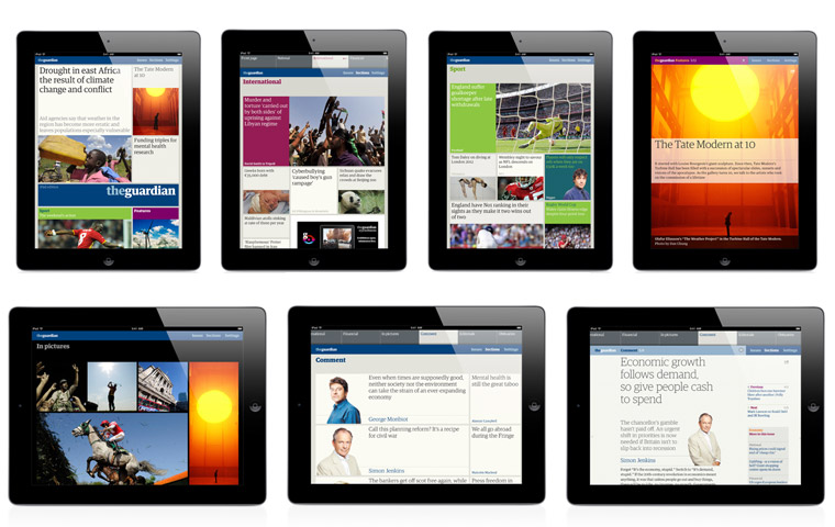
An example of this is the Guardian iPad app:

According to The Guardian’s Andy Brockle:
We have created something that is a new proposition, different to other digital offerings. It works in either orientation and nothing is sacrificed. Instead of it being based on lists, breaking news, and the fastest updates it’s instead designed to be a more reflective, discoverable experience.
Displaying images
With the ability to pinch and zoom, readers have the ability to look at images in great detail. This may mean writers will need to present their documents in SVG format, but if we assume they stick to bitmap formats such as .jpg and .png, we’re still likely to see a change in the way documents that rely on images are designed. Instead of needing a series of separate images to display detail, the writer can provide a single image for the reader to explore. It also seems likely we’ll see images that contain “layers” that can be peeled off to reveal the underlying details.
Unresolved aspects
We’re at the beginning of the process of making the most of portable devices with “real-life” displays, so document design is likely to evolve further. It’s still unclear what is the best navigation UI for iPad3 readers.
The bear trap
There is a huge bear trap waiting to catch out organisations – that they assume what works on iPad 3’s retina display will work on screens with lower resolutions.
Conclusion
The more you use the iPad’s new screen, the more you realise it will change the way documents are designed in the future – the biggest possibly being a move from on screen content being structured laterally instead of vertically. With predictions of there being more iPads than citizens of the United States of America by the end of next year, there’ll be more and more reasons for optimising content for the iPad 3.

[…] Designing documents for the iPad 3: the return of old design metaphors […]